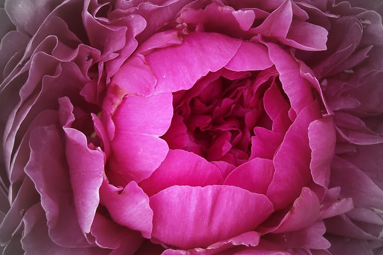
Recently I've been trying to find just the right color paint for my master bathroom. My vision is to have a soothing zen-like space in a shade of soft brown and blue, or soft brown and cream--depending on which towels I put up. So I've been to Lowe's a few times now for just the right shade of brown paint, something like chocolate milk with a little extra white milk thrown in to lighten it just a hair.
My first two colors, Milk Toast and Hopsack were complete failures. Lovely colors on their own, but not right for this purpose. Milk Toast was too pink and Hopsack was too yellow. Of course it doesn't help that we're covering over the existing blue paint which may be skewing my color perception slightly.
Usually when it comes to paint color I nail it on the first or second try. I don't know if it's genetic, or it's my training at the University of Michigan Art School but I can "see" color. Even a good 8 years later I look at the walls in the main part of my house and love the glowing amber colors. So I'll be heading back to Lowe's in the next few days to try a new color, Moose Mousse.
So my hubby told me he saw something on youtube.com that indicated that men see about 12 different colors. What 12 I don't know, but I'm pretty sure a light shade of chocolate milk isn't on that list. I'm not man bashing believe me, but I think men and women do view color differently.
Out shopping yesterday I noticed a lot of really lovely colors showcased in the Fall clothes, especially for women. Gorgeous shades of camel, cinnamon, teal, blue, gray and burgundy abounded. But, with burgundy for example, does it have more purple to it and hence should be called aubergine, or does it have more red to it and really be called wine? With gray is it pearl, smoke, slate or steel? There are so many different color interpretations out there this Fall season. When it came to the mens fashions there were many yummy shades of khaki, camel and green that were prevalent every where I went.
I've heard people say for years "I just can't wear that color." I personally don't think that's true. I think you can wear any color out there as long as you find the right hue and saturation. Take green for example. When I was younger I was told I couldn't wear green with red hair because I'd look like a stop sign. I'm not sure if it was out of spite or what, but I went out and bought a long green wool coat. It just takes the right shade of green. Greens with a yellow back note are not so hot for me, but you get a green with either a blue or olive tinge and I'm in heaven!
This color issue spills over to the jewelry world as well. People tell me all the time "I don't look good in yellow gold." Again, not true. Maybe a wide yellow gold bangle isn't right for you, but something more delicate and lacey might be. In that situation is has more to do with style and visual weight of the piece. You may have a personal preference for one color of gold over another, but I don't think looking good in a particular color is necessarily valid.
So tomorrow I'll go get a sample of that Moose Mousse paint and see if I've found the right color or not.

14. All men see in only 16 colors, like Windows default settings.... Peach, for example, is a fruit, not a color. Pumpkin is also a fruit. We have no idea what mauve is.
ReplyDeletehttp://www.youtube.com/watch?v=wosLlAob9bA
Thanks honey!
ReplyDelete